EPIC Club
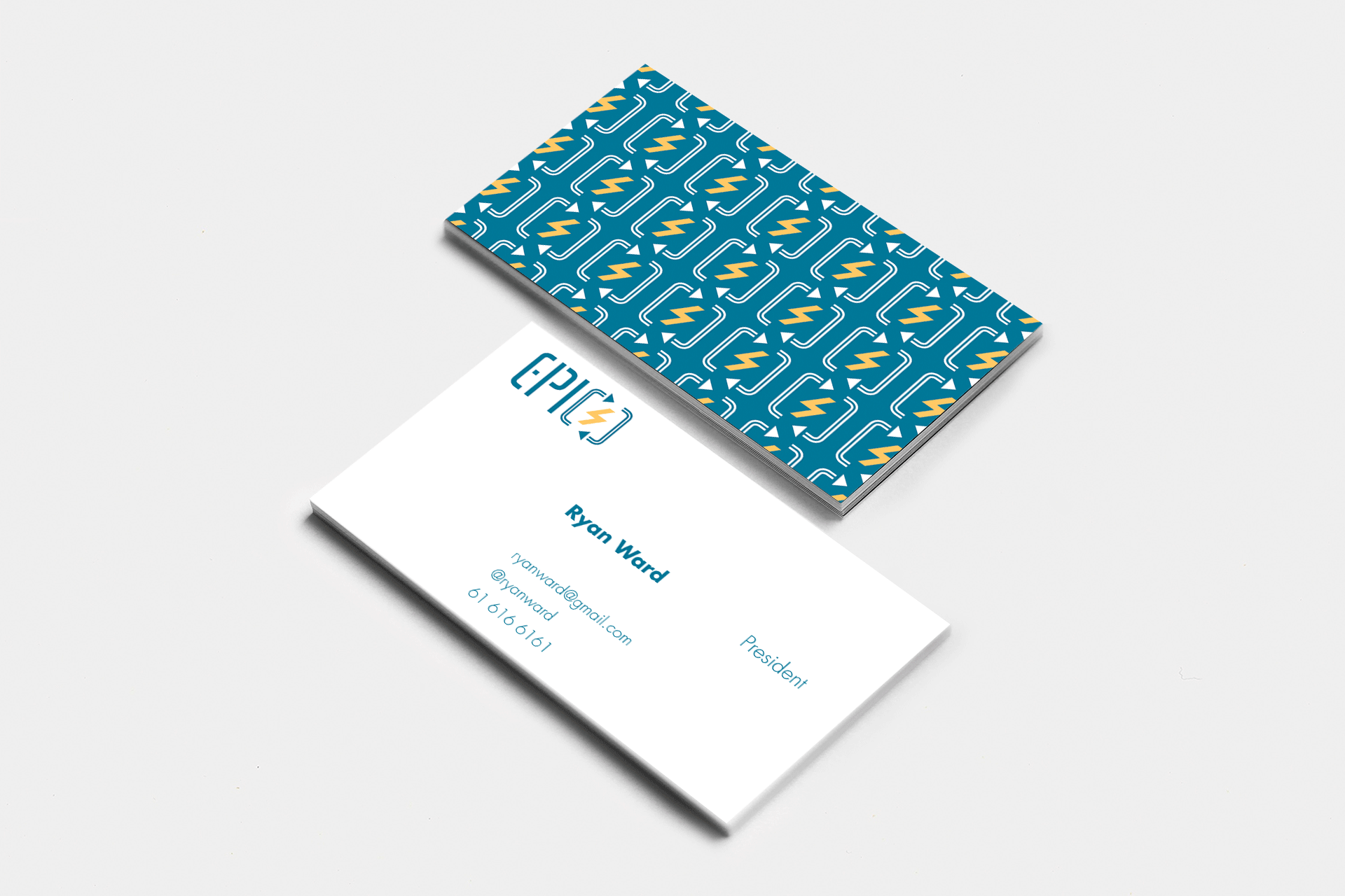
Logo created for the Electronics, Process Instrumentation and Computer Club at Delaware Technical Community College. Visual mark combines elements that represent the analog space of electronics and digital space of computer language inside a process of iteration and refinement. Typography is informed by the brackets in the visual logo, and by the binary language to further unify the analog and digital identities of the club.
Process
The project started out just writing out the name of the club in many different variations to understand the geometry of the letters and how they affect the space around them. This lead to exploring unique and flexible options from which to pull. After the initial idea generation for word variations I moved on to exploring the visual mark. Incorporating the technical aspect about the EPIC club was very important here. A certain level of abstraction needed to be maintained so members and non-members could identify the logo and associate it with any type of technical topic that could be of interest to the Club. After a healthy amount of exploration, the logo eventually came down to using two rounded brackets with white stripes down the middle with two arrow points on opposite ends and a smaller lightning bolt through the middle. This best captured the process of working with electronics and computer code in such an abstract way that it could be applied to anything with an electronic circuit or computer code. The typography came shortly after; declining to use a pre-existing sans-serif typeface in favor of a series of modified vertical bars and curves. Directly taking influence from the brackets in the visual mark to convey a bar code and binary esque appearance. This gave the wordmark good unity with the visual mark and a good stand alone identity if used by itself.
Analysis
A large amount of my decision making and design choice came from the EPIC clubs focus on technical areas of study, relating to electronics and computer code. Each previous iteration led me to a simpler and broader representation of the club logo in order to accommodate for a wider range of programs and activities. The colors were inspired by transistor color coding and for the sake of simplicity only two colors were used in execution. This also ensured that no information was lost if used in black and white, making the logo fully accessible to color blind students. Overall this logo was chosen because it represented a level of technical abstraction in an easily digestible form that different types of students and faculty could understand.
Responsibilities
- Logo design
- Business card design
- Poster design
Logo in normal color
Logo in inverted color
Logo in black and white
Logo on business card
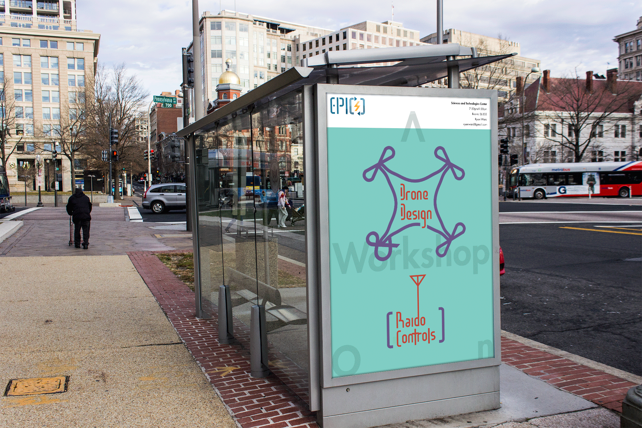
Logo on poster
